Responsive web design is a concept of creating a website what is adaptive to all browsers (software for browsing the internet) and devices that have access to its’ content.
Earlier websites were created with an assumption that online users view the content on certain resolutions. With growing number of devices with internet access that have a variety of screen sizes and resolutions, those assumtions are not valid anymore.
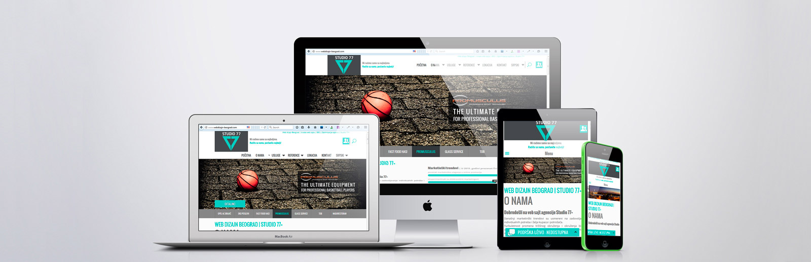
Today’s websites have to be available and adaptable for all devices with internet access. This approach requires totally different way of designing and creating the webpages. Studio 77+ is one of the pioneers in creating responsive websites in Serbia. We have studied new and modern website forms and ways for adapting websites for all devices with internet access.
In the 90s, website width was 640 pixels (px). In the beginning of the 21. Century it reached 800px. Six years ago new devices emerged with small screen and high resolution.
At that point, size didn’t matter anymore. Later, we were introduced to tablets that brought new standards to the web. It’s important to point out that that screen width and resolution was never known precisely, and it was just an assumption what was the most used screen resolution people uset to access the internet.
Today’s device screen resolutions for browsing the internet are a gret variety.
Lot of designers start with the idea that everyone visiting the website they are creating use a mouse, have fast internet access, new computers and calibrated monitors. That is certainly not the case, and it is a reason why modern website design has to be able to adopt to all types of devices and browsers available. That kind of website is and design is called responsive (respond, adapt).
Old way of creating websites doesn’t provide an optimal viewing experience and those website look completely rediculous today. Responsive websites provide an interface which adapts to screen resolution of all devices with internet access.
Therefore, when your website is responsive, it looks different on different screens and screen sizes. If you would like to see an example of a responsive website, visit kribzon.com and conciergebelgrade.com on your desktop or laptop personal computer and mobile phone that runs on andoid, iOS or other mobile platform.
In this example you will understand what responsive design means.
Imagine asking your realestate agent for the price of a house in Belgrade. It would be imposible to answer precisely.
It’s the same with responsive websites. You could say that the price for the responsive website is 30-40% higher in comparison to classic form of websites. As with standard websites, price for responsive website depends on the amout of work, working hours, website content etc.
Finally, a responsive website can be vey cheap with a price around $20-30 US dollars if you wish to buy a template that is used by 20.000-30.000 companies or individuals around the world.